← Back to Matte Objects
21 Objects Apple Designers Would Put In Their Homes
When Steve Jobs and Laurene Powell moved into their house in Palo Alto, they sat on the floor for years. Not because they couldn't afford furniture. Because Jobs couldn't find any that met his standard. He once told Walter Isaacson, "We spent a lot of time asking ourselves, 'What is the purpose of a sofa?'" The family lived in mostly empty rooms while Jobs interrogated every potential object that might enter them.
That's the part most people miss when they try to copy the Apple aesthetic. It's not white walls and matte everything. It's a standard so high that most furniture fails it. The man who built the company couldn't furnish his own house, because almost nothing on the market was good enough.
So when we say a home looks Apple-designed, we don't really mean a house with iPhones on every surface. We mean something more specific: a home that shares the design principles Apple has spent forty years refining. Surfaces without unnecessary detail. Objects that look engineered rather than decorated. Restraint that reads as confidence.
Bohlin Cywinski Jackson, the firm behind more than 70 Apple Stores worldwide, has shown that this aesthetic translates beautifully into physical space. But most of us aren't commissioning architects to design custom homes. We're filling the rooms we already have with objects that we hope share that same restraint.
What follows is a list for that. Twenty-one objects, available now, that share the design language Apple has spent forty years refining. Some are made by designers who once worked at Apple. Some are made by studios Apple's industrial designers reference as influences. None of them would have made Steve Jobs sit on the floor.
Organized by room, because that's how a home actually works.
Workspace
The desk is where most of us encounter the Apple aesthetic first, so it's where most of us learn to want it everywhere else.
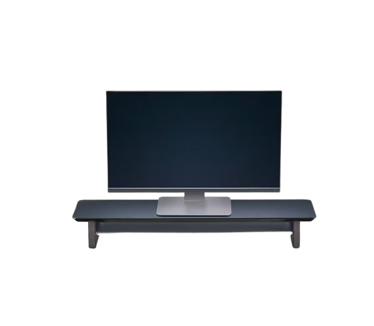
Powder-coated aluminum and cork, in the proportions Apple's own desk accessories would have if Apple still made them. The shelf raises a Mac to eye level and clears the surface beneath it for everything else. The foundation of every desk worth photographing.
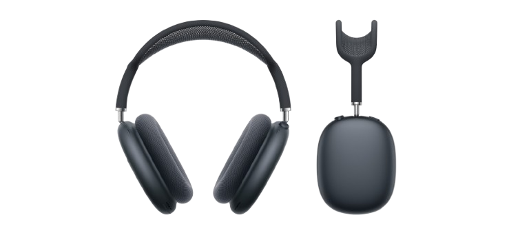
One of the most aesthetically defining objects Apple has made in recent years. Anodized aluminum cups, a breathable mesh canopy, weighted to feel like a precision instrument. Whatever's next to them in a room becomes calibrated to their standard.
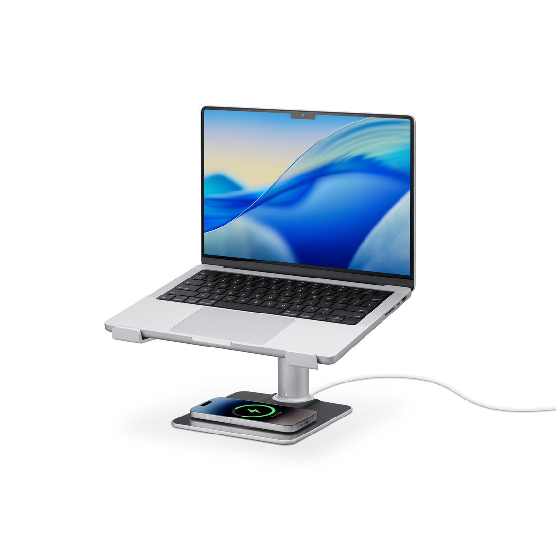
Brushed aluminum, designed to color-coordinate with Apple's silver Pro accessories. The kind of obsessive matching most furniture pretends not to care about. A laptop stand and MagSafe charger in one.
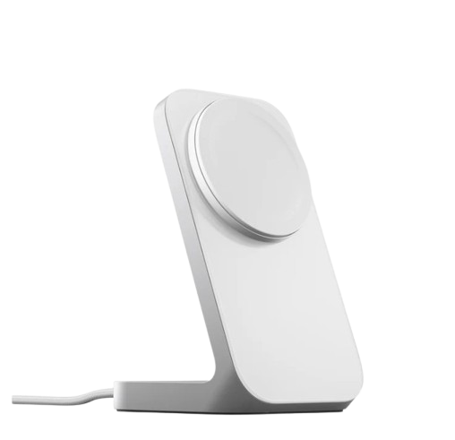
Metal and glass, weighted to stay put. A charger that looks like a small piece of furniture rather than a piece of plastic with an adhesive base. The kind of detail that quietly raises the whole desk.
Living Room
The room a guest sees first, and the room that says the most about what you believe a home should feel like.
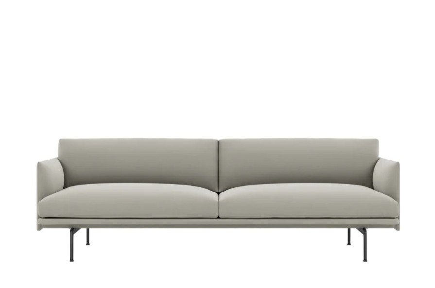
A clean, low-slung silhouette on slim steel legs. Designed by Anderssen and Voll, the same Norwegian duo behind Muuto's Oslo lounge chair, who share Apple's instinct for objects that look distilled rather than designed. The piece the whole room arranges itself around.
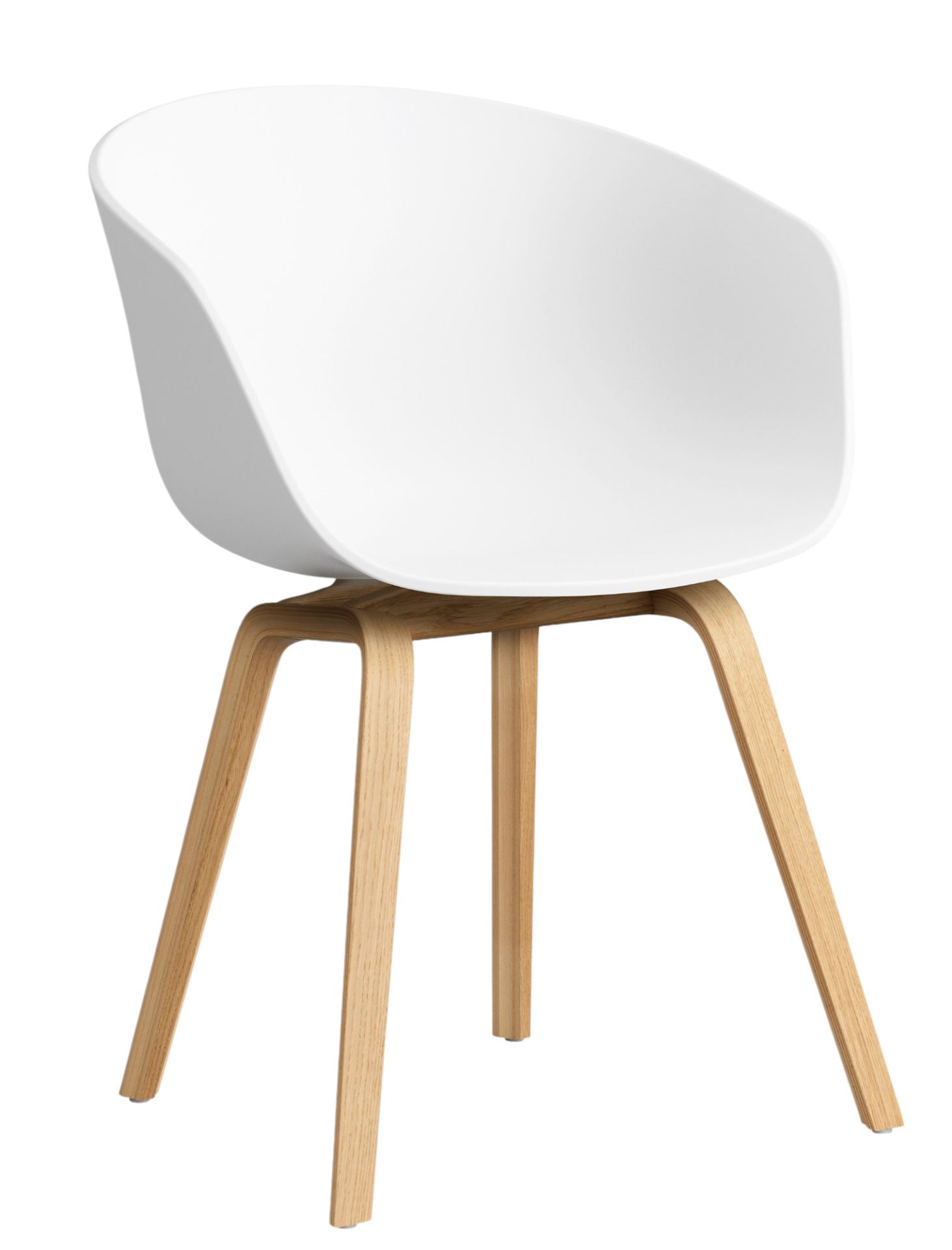
One clean molded shell on slim oak legs. A modern classic that quietly upgrades whatever room it sits in. Originally designed by Hee Welling for Hay in 2010, it has earned the rare designation of becoming a de facto standard. A chair that signals taste without trying.
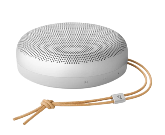
A spun aluminum dome over an acoustic fabric base. Portable, polished, and quietly the best looking thing on the table. Arguably the closest non-Apple equivalent in consumer hardware: restrained, material-forward, premium without ornament.
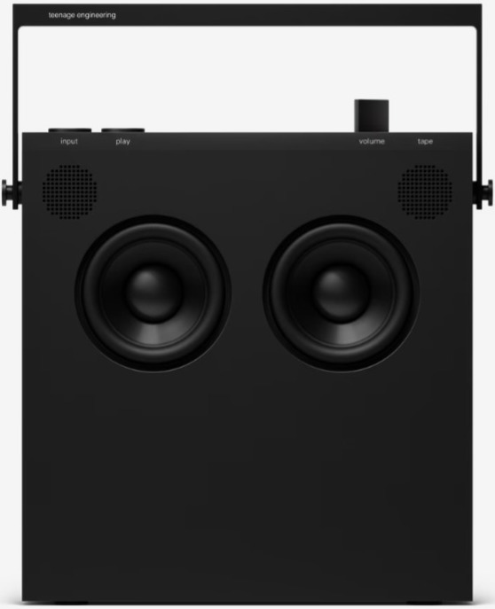
An ultra-thin slab speaker with a handle that doubles as a stand. The Swedish studio behind it has earned cult status among industrial designers for treating consumer electronics as instruments rather than gadgets. The object on the shelf that tells visitors you pay attention.
Kitchen
The kitchen is where the Apple aesthetic gets tested most honestly, because the room has to work. Most kitchen objects are designed to perform rather than to be looked at. The best are designed for both.
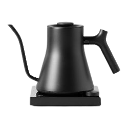
Matte black steel, a precision gooseneck, temperature to the degree. Fellow's industrial design has won multiple international awards, and the form is the rare case of function and aesthetic arriving at the same answer. The kettle that turns a morning into a ritual.
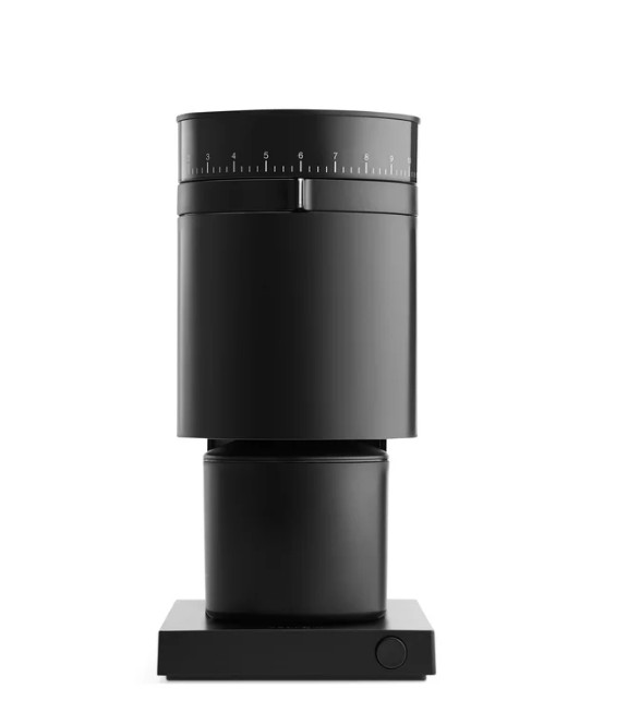
A burr grinder shaped like a small piece of equipment rather than a kitchen appliance. Matte black, quiet on the counter, considered down to the dial. Apple's industrial design team treats consumer hardware as instruments, and Fellow has clearly absorbed that lesson.
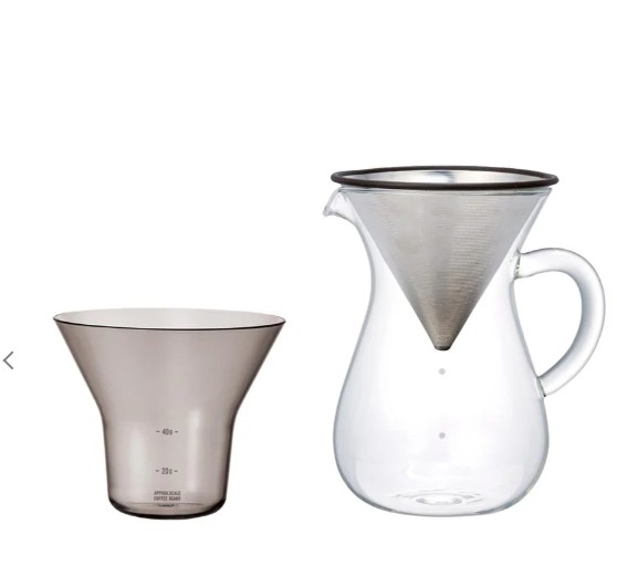
Japanese glass and matte stainless steel. The carafe and dripper look like laboratory apparatus more than coffee gear, which is exactly the point. Kinto, like Apple, treats everyday ritual objects with the seriousness of professional equipment.
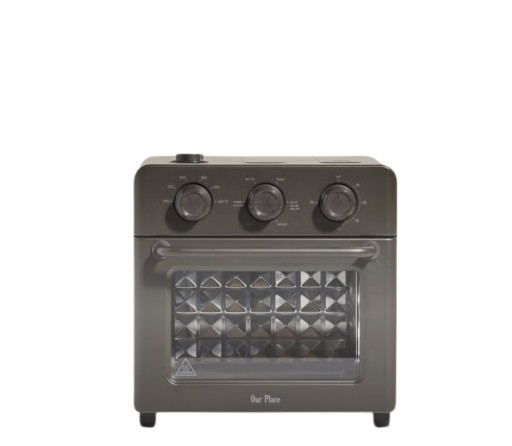
A countertop oven that hides its complexity behind a clean matte face. Steam-bake, air-fry, toast. All the function of a small kitchen's worth of appliances, in something the size of a microwave. Material honest, function dense, surface restrained.
Wellness
The wellness room is where most aesthetic catalogs fall apart, because wellness products are usually engineered as objects you hide. The ones below are designed to be left out.
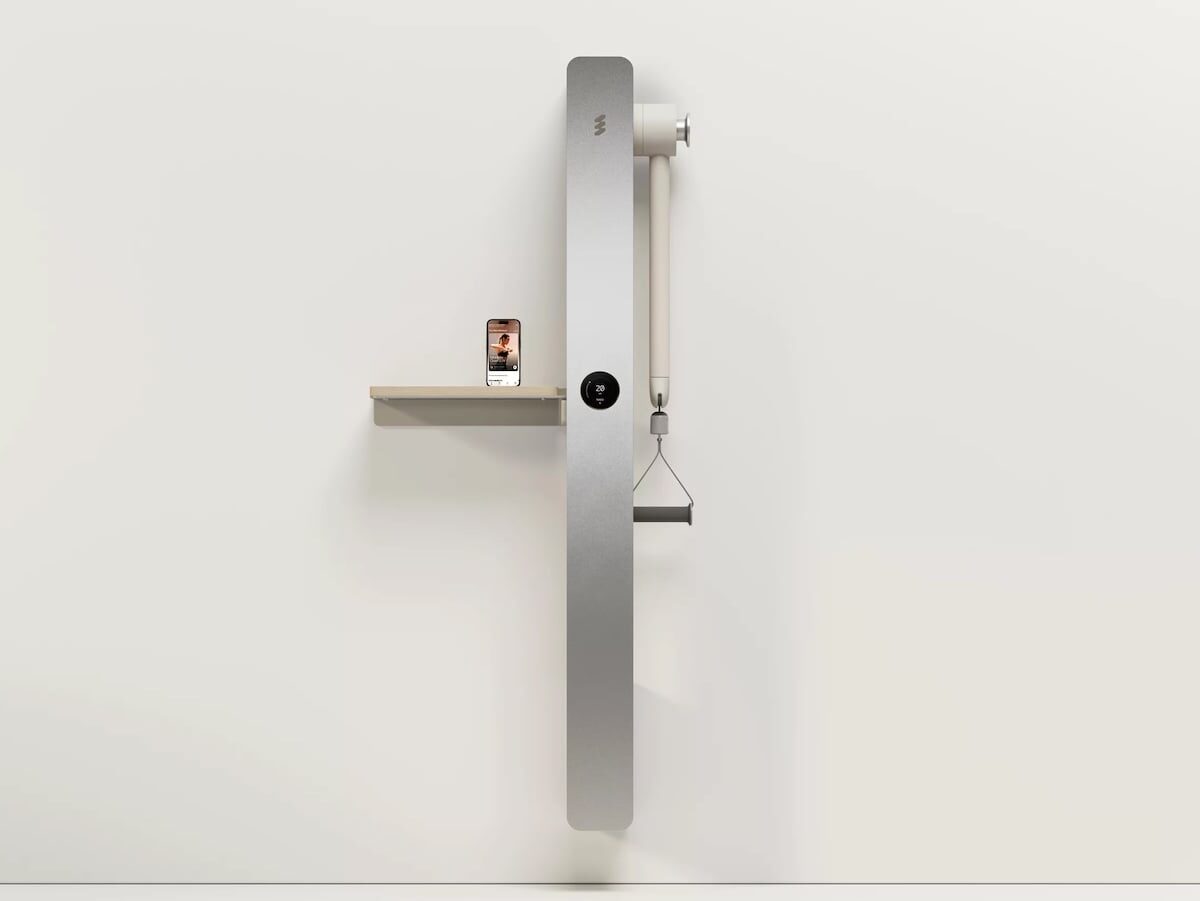
A wall-mounted gym designed by a team with talent from Apple, Nike, and Meta. Strength training, cardio, and recovery in a single panel the size of a full-length mirror. The product that proves the Apple aesthetic doesn't just apply to gadgets. It applies to whole product categories that no one thought needed it.
Pure white, perfectly round, completely unbranded. Muji's design philosophy of anonymous design that disappears into the room shares a deep root with Apple's instinct for objects that erase themselves until needed. The quietest way to make a room feel finished.
Amber pharmacy bottles with quiet typography. Aesop has spent decades refining packaging design that treats consumer products with the seriousness usually reserved for industrial materials. Design that happens to be soap.
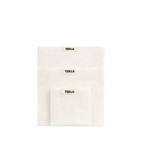
Muted organic cotton in colors named after weather. Tekla's products are an exercise in restrained color, never bright, never bold, just one note slightly off from white. The bathroom detail that signals taste before anyone says a word.
Bedroom
The room that matters most for how a home actually feels, and the room where Apple's restraint is hardest to achieve, because beds and bedding are usually where homes get loud.
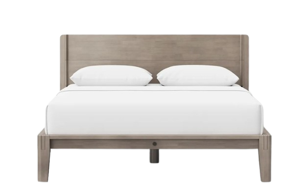
Japanese joinery, no tools, no hardware, no noise. Thuma reduced the bed frame to its essential structure and then refused to add anything back. The frame that makes a bedroom feel finished. The bed Apple would have designed if Apple designed beds.
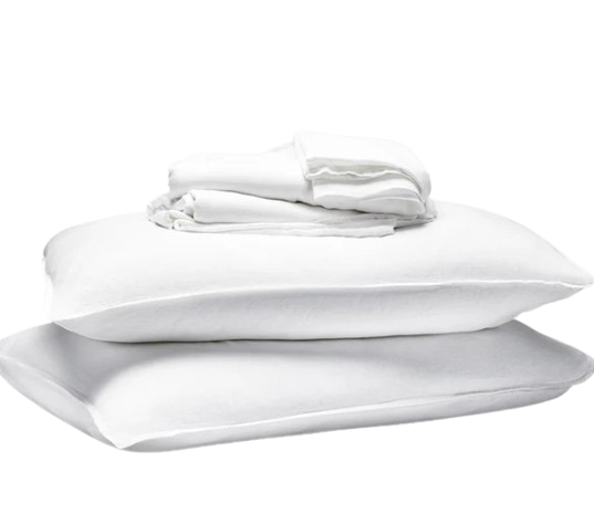
Muted, lived-in linen. Bedding that looks calm before you've made it. Brooklinen's color range stays inside a single quiet octave, the same restraint Apple applies to product color palettes, applied to the room you spend a third of your life in.
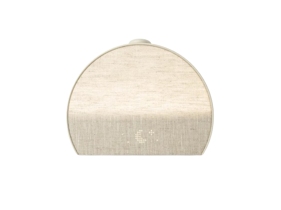
A soft dome of light that replaces the phone on your nightstand. Hatch is one of the few smart-home brands that designs hardware first and software second, which is the Apple sequencing, executed by a company that isn't Apple but understood the lesson.
Lighting
Lighting is what decides a room's mood after the sun goes down, and Apple's design language extends naturally into it. Every Apple Store is essentially a lighting demonstration. Most homes underinvest here. The ones that don't are the ones you remember.
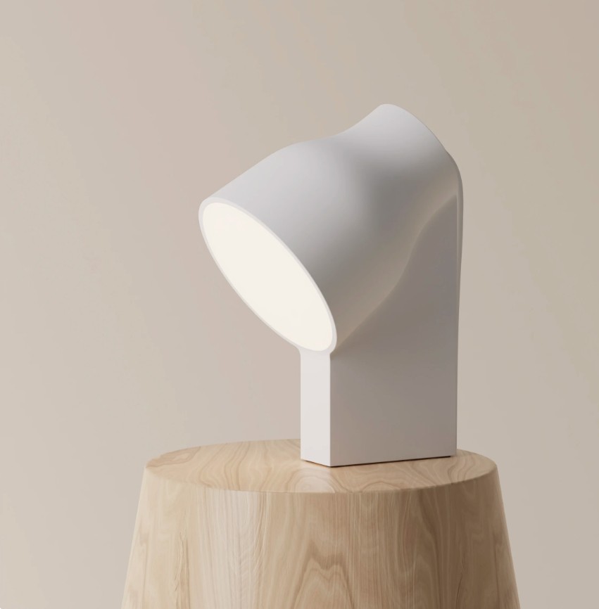
3D-printed and matte, carved like stone. The Ammunition studio, founded by Apple's former Director of Industrial Design Robert Brunner, designed it to look sculpted rather than manufactured. Light as a small piece of architecture.
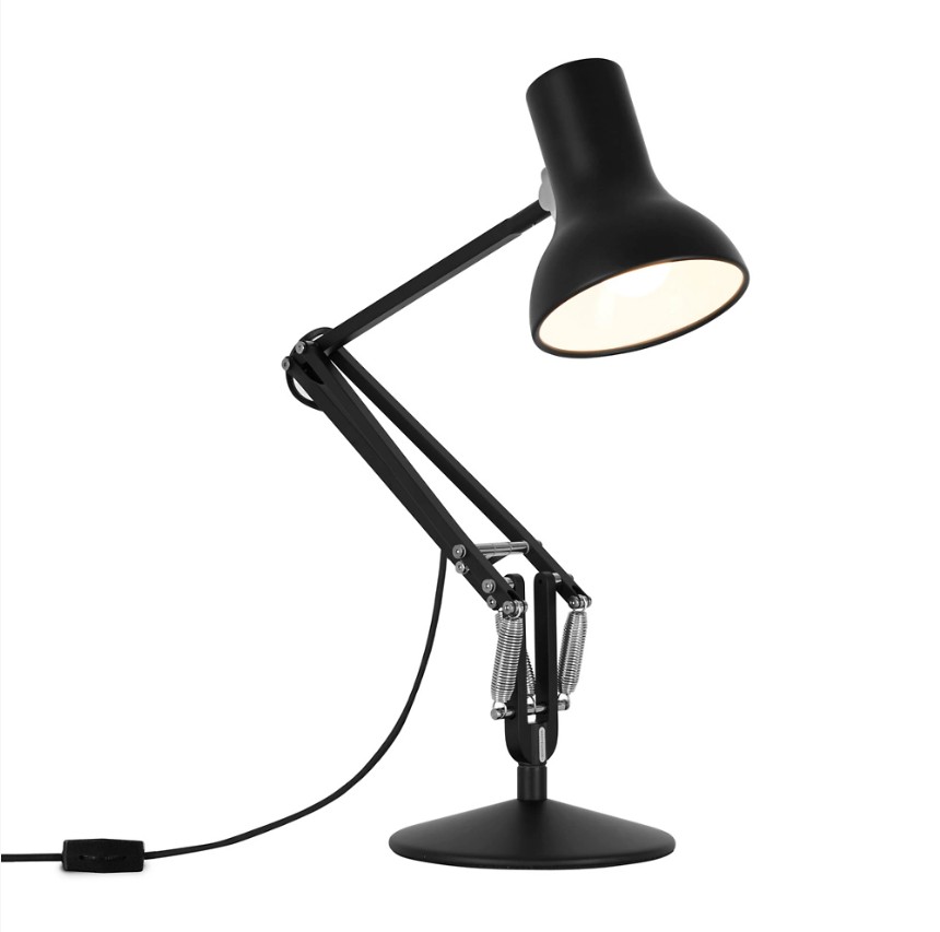
The design-classic task lamp, in a quiet matte finish. The Type 75 is what Dieter Rams would have chosen if he needed a desk lamp, and Rams is the designer Jony Ive has cited as a major influence on his work at Apple. A direct line from Rams through Apple back to the desk you sit at.
The home Jobs would have stopped sitting on the floor for
The Apple aesthetic isn't really about Apple. It's about a standard that very few objects in the world clear: surfaces without unnecessary detail, restraint that reads as confidence. Steve Jobs spent years not finding furniture that met it. The twenty-one objects above are the ones that do, not because they look like Apple products, but because they share the same design instincts.
Curate the home you actually want. The standard is the same whether you're building a billion-dollar company or just trying to make a room feel finished.
Curated by the Matte Objects team. We chose objects we'd put in our own homes, not paid placements.